UX/UI
web development
UX/UI
web development
Overview
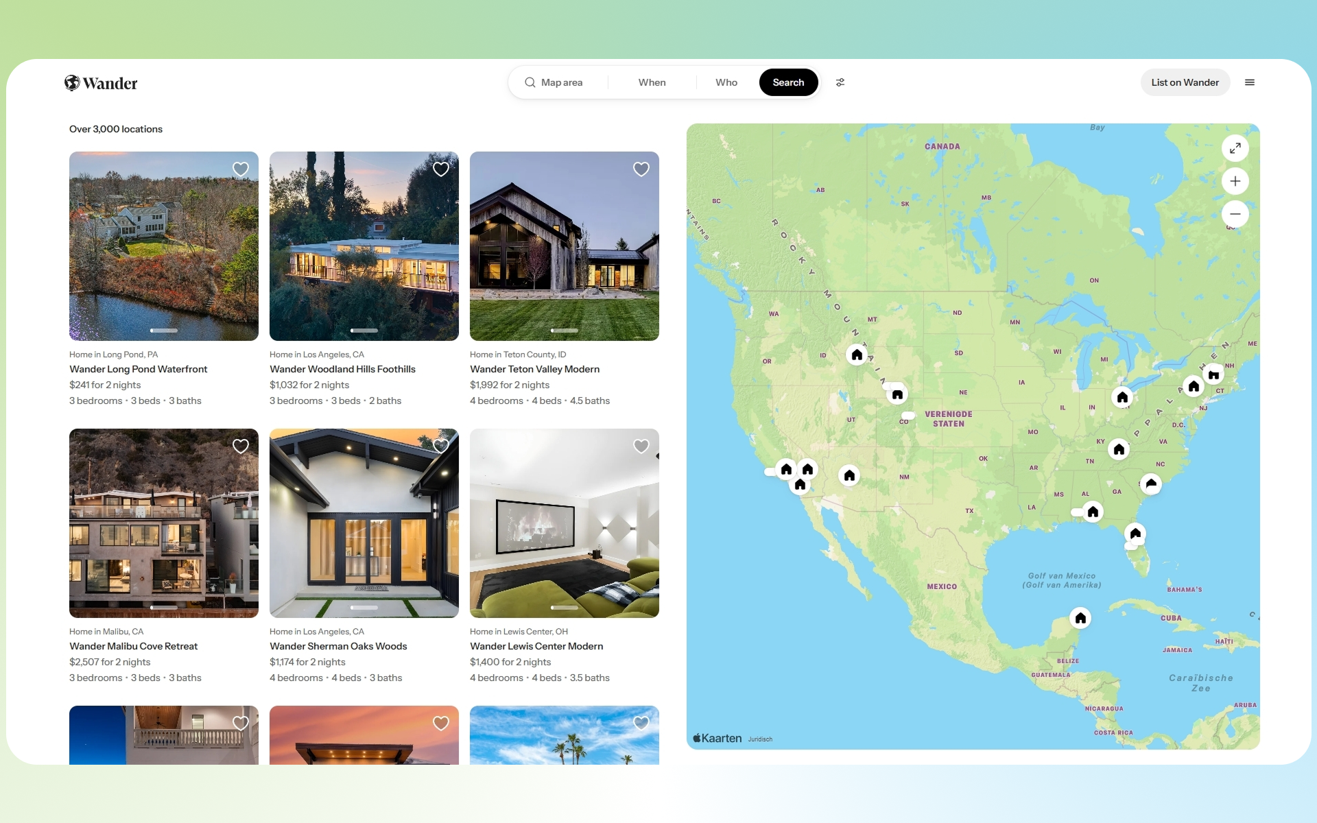
Wander is a premium vacation rental platform offering high end, fully managed homes across curated destinations. This project focused on redesigning the listings experience to help users explore properties more intuitively through a map first interface powered by Apple Maps on the web.
The goal was to bridge inspiration and booking by making discovery feel spatial, visual, and effortless.
Problem
Traditional listing pages (Airbnb-style grids) create friction when users are:
Exploring unfamiliar destinations
Comparing location based tradeoffs (beach vs. city vs. mountains)
Trying to understand proximity and geography
Users had to:
Jump between list view and maps
Lose context while browsing
Spend extra time filtering irrelevant options
Solution
We designed a hybrid listings + map experience, where users can browse properties and explore geography simultaneously.
At the core of the solution:
A custom Apple Maps integration embedded directly into the listings page
Real time synchronization between map and property cards
Boundary based search (dynamic map viewport updates listings)
Our Role
Frontend Development (map integration + UI logic)
UX Collaboration
Performance Optimization
API / data coordination
Key Features
1. Map First Discovery
Users can visually explore destinations instead of relying solely on filters.
Properties appear as interactive pins
Map movement dynamically updates listings
Encourages exploratory browsing behavior
This aligns with how users naturally plan travel geographically first.
2. Custom Apple Maps Integration
Instead of using default map embeds, we implemented a custom Apple Maps web experience:
Cleaner, more premium aesthetic (aligned with Wander brand)
Smooth zooming and panning
Better performance across devices
Apple Maps’ expanding web support allows it to run across modern browsers and devices, including mobile environments.
3. Synchronized List + Map UI
The listings grid and map are tightly coupled:
Hovering a listing highlights its map location
Clicking a pin scrolls to the corresponding listing
Maintains spatial awareness at all times
4. Dynamic Boundaries & Filtering
The page URL reflects map boundaries (as seen in your link), enabling:
Shareable search states
Server side or client side filtering based on viewport
Scalable browsing across large geographic regions
Design Decisions
Why Map + List Together?
Separating them creates cognitive load. Combining them:
Reduces context switching
Speeds up decision-making
Improves engagement
Why Apple Maps?
More minimal, premium feel vs alternatives
Strong ecosystem alignment (especially for iOS users)
Increasing viability on web platforms
Challenges
1. Performance with Large Datasets
Rendering many properties on a live map required:
Marker clustering / optimization strategies
Lazy loading based on viewport
2. State Synchronization
Keeping map position, filters, and listings in sync required:
URL driven state management
Careful handling of edge cases (zoom, pan, pagination)
3. UX Tradeoffs
Map heavy layouts can:
Overwhelm users
Reduce focus on listings
We balanced this by:
Maintaining a strong grid layout 1x1 or 50/50
Keeping interaction predictable
Results:
↑ Increased user engagement with listings
↑ More time spent exploring destinations
↓ Friction in property discovery
What We Learned
Spatial interfaces dramatically improve discovery for travel products
Map UX is powerful but only when tightly integrated with content
Performance and UX are deeply connected in map based products