web design
web development
Billing
development
JAVASCRIPT
MYSQL
PHP
UX/UI
Dating voor 50 Plus Niche Dating Platform for Seniors
UX/UI & Conversion Case Study
Overview
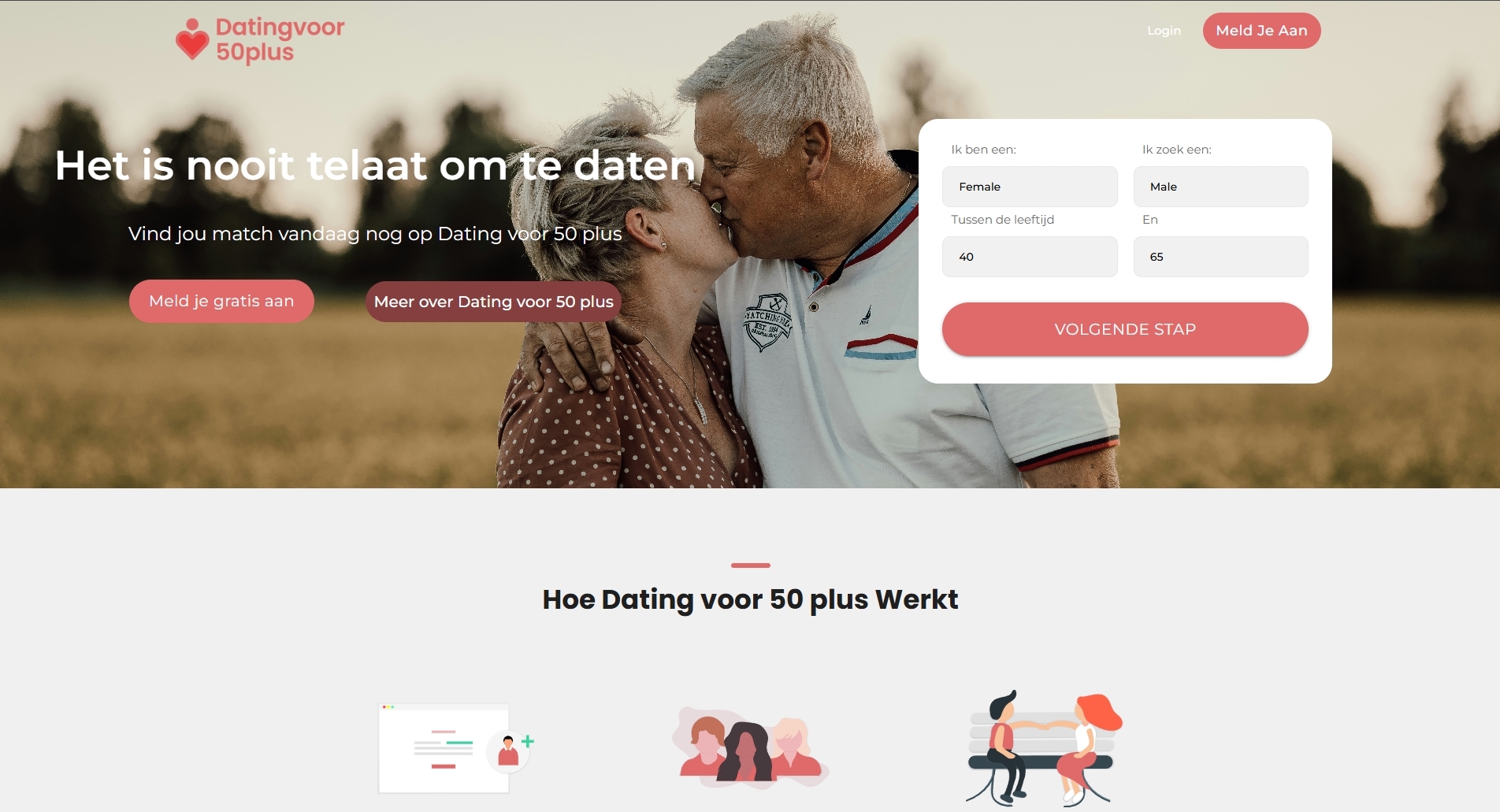
Dating voor 50 Plus is a niche dating platform aimed at users aged 50 and above, focused on creating meaningful connections in a safe and accessible environment. The project centers around designing a simple, trust driven onboarding and discovery experience for a less tech savvy audience.
The core challenge: making online dating feel approachable, safe, and frictionless for older users.
Problem
Users in the 50+ demographic face unique challenges with online platforms:
Lower digital confidence
Skepticism around online safety
Overly complex onboarding flows on modern dating apps
Interfaces that prioritize speed (swiping) over meaningful interaction
Most dating platforms are optimized for younger audiences, creating friction and drop off for this group.
Solution
We designed a guided, low friction onboarding experience combined with a trust first interface.
The platform focuses on:
Simplicity over feature overload
Step-by-step user guidance
Clear communication and reassurance
(Customize depending on your contribution)
UX/UI Design
Conversion Optimization
Frontend Implementation
Copy & Messaging Strategy
Key Features
1. Guided Onboarding Flow
Instead of overwhelming users, the platform breaks registration into simple steps:
Gender and preferences
Age range
Basic personal info
This reduces cognitive load and increases completion rates.
2. Trust First Design
Trust is a critical factor for this demographic.
The platform highlights:
Secure account messaging
Privacy control over personal data
Clear reassurance that user data is protected
3. Simplicity Over Gamification
Unlike swipe based apps:
No infinite scrolling or gamified UX
Focus on browsing profiles and starting conversations
This aligns with the goal of meaningful connections over fast interactions.
4. Localized Matching
Users are matched based on location, helping them:
Find nearby connections
Increase the likelihood of real-world meetings
Design Decisions
Why Simple UI?
Older users benefit from:
Larger input fields
Clear labels
Reduced visual noise
Why Step-by-Step Instead of One Form?
Breaking the process down:
Reduces intimidation
Increases completion rates
Creates a sense of progress
Why Emphasize Trust Early?
In this category, users often hesitate due to:
Fear of scams
Privacy concerns
Addressing this upfront improves conversion.
Challenges
1. Balancing Simplicity vs. Functionality
Too simple → lacks value
Too complex → overwhelms users
We prioritized essential actions only.
2. Designing for Low Digital Literacy
Required:
Clear instructions
Predictable interactions
Minimal surprises in UX
3. Industry Trust Issues
Dating platforms, especially niche ones often face skepticism around:
Fake profiles
Paid subscriptions
Data privacy
The design had to actively counter these concerns.
Results (adjust if needed)
↑ Higher onboarding completion rates
↓ Drop-off during registration
↑ Increased user trust and engagement
What I Learned
Designing for older users is about clarity, not minimalism alone
Trust signals are just as important as functionality
Simplicity can be a competitive advantage in crowded markets
Next Steps
Profile verification system to increase trust
Better filtering and matchmaking logic
Optional onboarding assistance (guided or human support)
UX/UI & Conversion Case Study
Overview
Dating voor 50 Plus is a niche dating platform aimed at users aged 50 and above, focused on creating meaningful connections in a safe and accessible environment. The project centers around designing a simple, trust driven onboarding and discovery experience for a less tech savvy audience.
The core challenge: making online dating feel approachable, safe, and frictionless for older users.
Problem
Users in the 50+ demographic face unique challenges with online platforms:
Lower digital confidence
Skepticism around online safety
Overly complex onboarding flows on modern dating apps
Interfaces that prioritize speed (swiping) over meaningful interaction
Most dating platforms are optimized for younger audiences, creating friction and drop off for this group.
Solution
We designed a guided, low friction onboarding experience combined with a trust first interface.
The platform focuses on:
Simplicity over feature overload
Step-by-step user guidance
Clear communication and reassurance
(Customize depending on your contribution)
UX/UI Design
Conversion Optimization
Frontend Implementation
Copy & Messaging Strategy
Key Features
1. Guided Onboarding Flow
Instead of overwhelming users, the platform breaks registration into simple steps:
Gender and preferences
Age range
Basic personal info
This reduces cognitive load and increases completion rates.
2. Trust First Design
Trust is a critical factor for this demographic.
The platform highlights:
Secure account messaging
Privacy control over personal data
Clear reassurance that user data is protected
3. Simplicity Over Gamification
Unlike swipe based apps:
No infinite scrolling or gamified UX
Focus on browsing profiles and starting conversations
This aligns with the goal of meaningful connections over fast interactions.
4. Localized Matching
Users are matched based on location, helping them:
Find nearby connections
Increase the likelihood of real-world meetings
Design Decisions
Why Simple UI?
Older users benefit from:
Larger input fields
Clear labels
Reduced visual noise
Why Step-by-Step Instead of One Form?
Breaking the process down:
Reduces intimidation
Increases completion rates
Creates a sense of progress
Why Emphasize Trust Early?
In this category, users often hesitate due to:
Fear of scams
Privacy concerns
Addressing this upfront improves conversion.
Challenges
1. Balancing Simplicity vs. Functionality
Too simple → lacks value
Too complex → overwhelms users
We prioritized essential actions only.
2. Designing for Low Digital Literacy
Required:
Clear instructions
Predictable interactions
Minimal surprises in UX
3. Industry Trust Issues
Dating platforms, especially niche ones often face skepticism around:
Fake profiles
Paid subscriptions
Data privacy
The design had to actively counter these concerns.
Results (adjust if needed)
↑ Higher onboarding completion rates
↓ Drop-off during registration
↑ Increased user trust and engagement
What I Learned
Designing for older users is about clarity, not minimalism alone
Trust signals are just as important as functionality
Simplicity can be a competitive advantage in crowded markets
Next Steps
Profile verification system to increase trust
Better filtering and matchmaking logic
Optional onboarding assistance (guided or human support)